
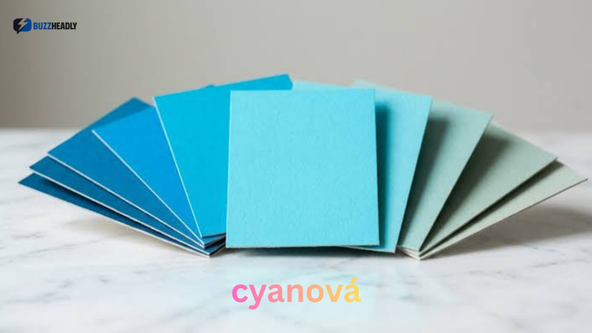

Have you ever come across an unusual color name and wondered whether it describes a completely new shade or simply another version of a familiar color? Cyanová is one such expression. Its distinctive spelling can make it look like a brand, a person’s name, or even a newly developed design trend. However, its connection to the familiar blue-green color cyan offers a much more interesting explanation.
Understanding Cyanová involves looking at both language and color. The word is associated with Slovak grammatical forms, where adjectives change according to the gender of the nouns they describe. It also connects to cyan, a color widely used in digital graphics, photography, printing, and contemporary design.
This guide explains what Cyanová means, how it differs from standard cyan, where its linguistic form comes from, and how cyan-inspired shades can be used in practical creative projects. Whether you are a designer, student, artist, or simply curious about unusual words, you will find useful explanations without confusing informal color descriptions with established technical standards.
What Is Cyanová?
Cyanová is a feminine grammatical form of the Slovak adjective cyanový, meaning cyan-colored.
In simple English, it can be translated as cyan-colored or having a cyan appearance.
The word is related to cyan, a bright color positioned between blue and green. It is particularly familiar in printing and digital design because cyan is one of the primary components of the CMYK printing process.
The spelling of Cyanová can initially be confusing for English speakers because English adjectives generally do not change according to grammatical gender.
In Slovak, however, adjectives change their endings to agree with the nouns they describe. The form cyanová is therefore a grammatical variation rather than the name of an entirely different color.
For example, the expression describing a cyan-colored feminine noun can use the feminine adjective form.
This distinction is important because Cyanová does not have its own universally recognized color standard separate from cyan.
Is Cyanová an English Word?
Cyanová is not a standard English color name.
It is associated with Slovak grammatical usage, while English speakers normally use the word cyan.
The accent over the letter á is also meaningful. It should be preserved when writing the original Slovak form because removing diacritical marks changes the appearance and linguistic accuracy of the word.
For English-language content, cyan-colored is generally the clearest translation.
Understanding the Color Behind Cyanová
To understand Cyanová visually, it helps to explore cyan itself.
Cyan is a vivid blue-green color that sits between traditional blue and green. Depending on its intensity and surrounding colors, it can appear fresh, cool, energetic, or technological.
Its appearance is familiar in digital interfaces, printed materials, scientific diagrams, and creative artwork.
What Is the Standard Cyan Color Code?
In standard CSS digital color notation, pure cyan has the following values:
| Color property | Standard cyan value |
|---|---|
| HEX | #00FFFF |
| RGB | 0, 255, 255 |
| Red | 0 |
| Green | 255 |
| Blue | 255 |
| CMYK idealized value | 100%, 0%, 0%, 0% |
These values describe standard digital cyan, not a separate official Cyanová shade.
The RGB combination produces cyan by using maximum green and blue light without red light.
This makes cyan especially noticeable on electronic displays.
Is Cyanová a Separate Color?
No independently standardized Cyanová color specification has been established.
It is more accurate to understand it as a language-related form associated with cyan.
Designers may also use Cyanová informally to describe a broader family of blue-green shades. These might include bright cyan, pale aqua, turquoise-inspired tones, and deeper blue-green variations.
However, an informal design label should not be confused with a recognized technical color specification.
If exact color reproduction matters, always use a HEX, RGB, CMYK, or other appropriate color value.
The Linguistic Origins of Cyanová
The spelling of Cyanová provides an interesting example of how languages adapt descriptive words.
Slovak is a language with grammatical gender. Nouns are generally classified as masculine, feminine, or neuter, and adjectives change their endings to match the nouns they describe.
The Slovak adjective cyanový has several grammatical forms:
- Cyanový: Masculine form.
- Cyanová: Feminine form.
- Cyanové: Neuter form.
The feminine form is particularly relevant when describing the feminine Slovak noun farba, meaning color.
This explains why Cyanová looks different from the familiar English word cyan.
Where Does the Word Cyan Come From?
The English word cyan has historical roots in Greek.
It is connected to the Greek word kyanos, associated with dark blue or blue-colored material.
Over time, the term developed into the modern color name used in art, science, photography, and printing.
It is important to distinguish the history of cyan from the grammatical development of Cyanová. The Greek connection explains the underlying color word, while the Slovak ending explains the distinctive form.
Cyanová vs. Cyan, Turquoise and Teal
People sometimes use cyan, turquoise, and teal interchangeably because all three belong to the blue-green color family.
However, they are not identical.
Understanding their differences helps when choosing colors for a website, clothing collection, logo, or interior design project.
Cyan
<text>Pure digital cyan is bright, vivid, and highly noticeable. It is commonly associated with technology, digital graphics, and printing.</text>
Turquoise
Turquoise combines blue and green with a distinctive decorative appearance. Depending on the shade, it can feel softer and more natural than pure cyan.
Teal
Teal is generally darker and more subdued than bright cyan. It works particularly well when a design needs a sophisticated blue-green appearance.
Aqua
Aqua often refers to lighter, refreshing blue-green shades. It can be useful for backgrounds, decorative elements, and relaxed visual themes.
| Color | General appearance | Common design use |
|---|---|---|
| Cyan | Bright blue-green | Digital graphics |
| Turquoise | Decorative blue-green | Fashion and interiors |
| Teal | Deep blue-green | Professional branding |
| Aqua | Light blue-green | Soft backgrounds |
| Cyanová | Cyan-colored linguistic form | Color description |
One useful distinction is that these names describe color families or language forms, not necessarily identical technical values.
Practical Uses of Cyan-Inspired Colors
Cyan is versatile because it can be used as either a dominant color or a supporting accent.
The best application depends on the intensity of the shade, the surrounding palette, and the purpose of the design.
1. Graphic Design
Cyan is widely used in digital artwork, illustrations, posters, and promotional materials.
Its brightness helps important visual elements stand out.
For example, a designer creating a technology-related poster might combine cyan accents with dark navy backgrounds and white typography.
This creates a strong contrast while maintaining a clean appearance.
However, using too much bright cyan can make a design visually overwhelming.
2. Website and User Interface Design
Cyan-inspired shades can give websites a modern and energetic appearance.
They are useful for:
- Buttons and interactive elements.
- Decorative backgrounds.
- Icons and illustrations.
- Navigation highlights.
- Charts and information displays.
A practical approach is to use cyan for selected interface elements rather than covering every section with the same bright shade.
Text readability should always come first.
3. Fashion and Clothing
Cyan can create a distinctive appearance in fashion.
It works well in sportswear, summer clothing, accessories, and statement pieces.
A bright cyan shirt, for example, can be balanced with neutral trousers or darker footwear.
For everyday outfits, softer aqua or deeper teal may be easier to combine with existing clothing.
4. Interior Design
Cyan-inspired colors can bring a fresh appearance to indoor spaces.
They can be introduced through:
- Decorative cushions.
- Wall accents.
- Furniture details.
- Kitchen accessories.
- Bathroom decorations.
- Small decorative objects.
A useful approach is to combine bright cyan with neutral colors such as white, beige, grey, or natural wood.
This allows the color to remain noticeable without dominating the room.
5. Branding and Business Identity
Businesses sometimes choose blue-green colors to communicate freshness, clarity, innovation, or modernity.
Cyan can be particularly suitable for technology companies, creative services, digital products, and businesses with a contemporary identity.
However, color selection should reflect the actual business personality rather than simply follow popular design trends.
How to Choose the Right Cyan Shade
Choosing the right shade is not simply about selecting the brightest available color. The surrounding environment, lighting, display settings, and intended purpose all influence how a color looks.
Here are some practical considerations.
Consider the Purpose
Start by identifying what the color needs to achieve.
- For attention-grabbing designs, bright cyan can be effective.
- For professional branding, darker teal or muted cyan may work better.
- For relaxing interiors, pale aqua can create a softer appearance.
- For digital interfaces, carefully selected cyan accents can highlight important actions.
Combine Cyan With Suitable Colors
Cyan can work with several complementary and neutral colors.
White: Creates a clean, bright, minimalist appearance.
Navy blue: Adds depth and provides a professional contrast.
Grey: Balances the brightness of cyan.
Orange: Creates a strong contrasting combination.
Beige: Makes cyan feel warmer and less futuristic.
Black: Produces a dramatic appearance, particularly in technology-inspired designs.
An interesting design technique is to use a small amount of orange alongside a predominantly cyan palette. This contrast can make important elements more noticeable without requiring additional decorative effects.
Check Color Contrast Before Publishing
A common mistake is selecting colors because they look attractive without checking whether text is readable.
Bright cyan on a white background can be difficult to read, especially when used for small text.
For accessible digital designs, test text and background combinations against recognized accessibility contrast guidelines.
A darker blue or navy text color is often more practical than white text on bright cyan.
Common Mistakes When Using Cyanová
Understanding the meaning of Cyanová is only part of using it correctly. There are several mistakes worth avoiding.
Treating Cyanová as an Official New Color
Cyanová is associated with cyan, but it does not have an independently established international color specification.
Avoid presenting it as a newly discovered pigment or officially registered color.
Confusing Cyan With Turquoise
Although the colors are related, their visual characteristics differ.
Choosing turquoise when a project requires bright cyan can change the entire appearance of a design.
Use actual color values instead of relying entirely on descriptive names.
Ignoring Differences Between Screens and Printing
A color that looks vivid on a phone may appear different when printed.
Digital displays use RGB light, while conventional process printing uses CMYK inks.
Paper type, printer calibration, ink quality, and color profiles can all influence the final result.
For professional printing, reviewing a physical proof is a useful precaution.
Using Too Much Bright Cyan
Cyan is naturally noticeable. Covering an entire design with intense cyan can make it tiring to look at.
A balanced palette usually produces a more polished result.
Three Interesting Insights About Cyanová
1. Language Can Change a Color Word Without Changing the Color
The difference between cyan and cyanová demonstrates how grammatical systems influence vocabulary.
A language can modify a descriptive word to match the noun it describes without introducing a different visual concept.
This is why understanding grammar can be just as important as understanding color terminology.
2. Digital Cyan and Printed Cyan Are Not Identical
Pure digital cyan uses the RGB value 0, 255, 255. However, printing cyan ink does not necessarily reproduce that exact appearance.
This happens because screens create colors through emitted light, whereas printed materials reflect light from their surfaces.
Consequently, a designer working on both digital and printed products should maintain separate color specifications.
3. The Surrounding Colors Can Change How Cyan Appears
A cyan shade may look brighter beside dark navy than beside white.
This is an example of simultaneous color contrast, where surrounding colors influence how people perceive a particular shade.
The practical lesson is simple: never evaluate a color palette by examining individual swatches alone. Always test the colors together in their intended environment.
FAQ
1. What does Cyanová mean in English?
Cyanová is a feminine form of the Slovak adjective cyanový. It means cyan-colored or having a cyan appearance. The English equivalent is usually simply cyan-colored.
2. Is Cyanová a real color?
Cyanová is a genuine color-related linguistic expression, but it is not a separate internationally standardized color. It is connected with the established blue-green color cyan. Informal design usage may also apply the name to different cyan-inspired shades.
3. What is the HEX code for Cyanová?
There is no universally accepted independent HEX code for Cyanová. The standard CSS digital cyan color is #00FFFF, with RGB values of 0, 255, and 255. Designers should use these values only when standard digital cyan is the intended shade.
4. What is the difference between Cyanová and turquoise?
Cyanová is a grammatical form associated with cyan, whereas turquoise is a separate color name. Cyan is generally brighter and more vivid, while turquoise often has a softer decorative appearance. The two colors can look similar but should not automatically be treated as identical.
5. Is Cyanová a brand or a person’s name?
The word can be adopted as a business name, username, or creative identity, but its spelling alone does not identify a particular company or individual. Its established linguistic connection is with cyan-colored descriptions. Always examine the context before assuming it refers to a person or brand.
6. How can Cyanová be used in graphic design?
Cyan-inspired colors can be used for website accents, illustrations, branding, buttons, backgrounds, and promotional materials. Combining bright cyan with navy, white, or grey can create a balanced appearance. For professional work, specify exact color values and check readability before publishing.
Conclusion
Cyanová is an interesting example of how language and color terminology come together. Its distinctive spelling is connected to the Slovak feminine form of an adjective describing cyan, rather than an entirely new color category.
The underlying color has important applications in digital graphics, printing, fashion, branding, and interior design. Understanding its relationship with turquoise, teal, and aqua can also help designers make more informed creative decisions.
Perhaps the most important lesson is that color names and technical color specifications serve different purposes. A descriptive word communicates an idea, while a precise HEX, RGB, or CMYK value helps reproduce a particular shade consistently.
Whether you are exploring the word for language research or using cyan-inspired colors in a creative project, understanding this distinction will help you use the term accurately and confidently.